Kansai Nerolac Paints, In-store kiosk
Nerolac Paint+ Corner
An in-store kiosk that helps paint dealers and sales staff reach the right tools in a couple of taps.
- Client
- Kansai Nerolac Paints
- Format
- In-store kiosk
- Scope
- UI/UX, Web app, User flow structuring
The problem
Two very different groups, dealers and sales staff, would use the same kiosk in a busy store. It had to be simple enough that nobody needed instructions.
What I did
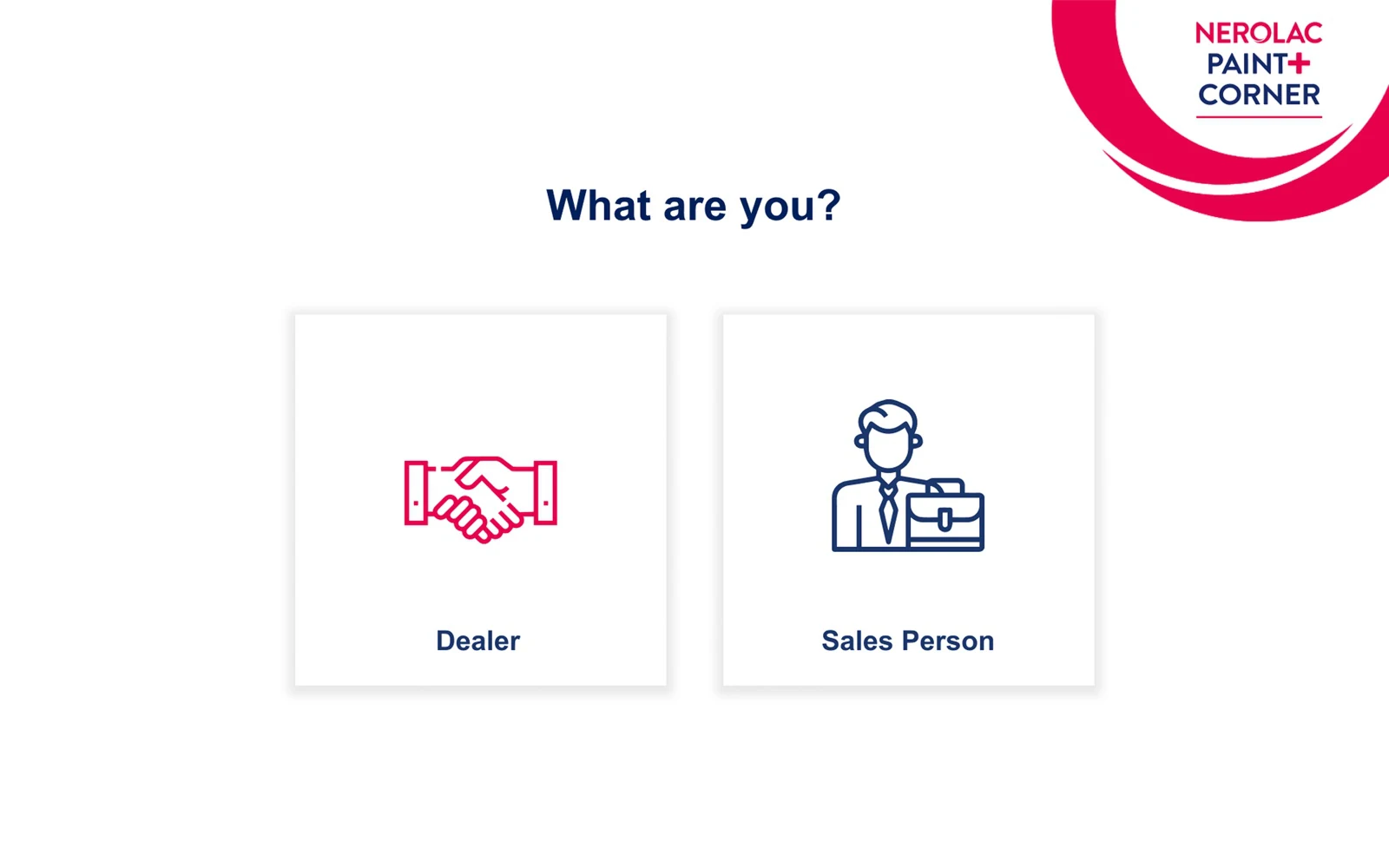
I designed a short, on-brand flow: a clear welcome screen, a simple "What are you?" choice with large icons, and then tools made for that role, like a room style picker and colour selector.
What changed
One kiosk serving two audiences, with no confusion about where to go next.
Screens
Select any screen to view it larger.
Welcome screen Choosing between dealer and sales person Room style and colour picker
Have something similar in mind?
Start a projectThese are representative screens shared with permission for portfolio purposes. Full projects and source files stay private under NDA.